
Colour is a characteristic of human visual perception whereby different wavelengths are perceived with concepts. Color is a figment of our imagination. colour wheel explains about relationship between colours. Here in this article, we find the basic aspects related to properties of colour.
Properties of Colour
The three main properties of colour are
- Hue
- Value
- Intensity
Hue
- Hue is the pure form of color that has not mixed with black or white
- It is the another name of color
- Hue represents a specific wavelength of color
- A hue is a color that is in the color spectrum
- Example: hues are basic colors like red, blue, green, yellow, orange, violet.
Value
- Value is the lightness or darkness of color it reflects to black and white.
- We can change the value of a color by adding black or white to it.
- Value refers to lightness or darkness of color (tint, shade, tone)
TINT = HUE MIXED WITH WHITE
SHADE = HUE MIXED WITH BLACK
TONE = HUE MIXED WITH GREY
White, black and grey are referred to as values without hue or intensity
TINT
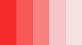
- Tint is made by adding white to the pure or original color.
- By adding white the color becomes lighter than the original color.
- A tint is lighter and has a higher reflective value than the original color.
- For example, we can make red lighter by mixing with various traces of white.
- To remember shade easily you can start with hue (ex. Red as shown) and slowly lighten by adding small amounts of white.
SHADE
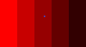
- Shade is made by adding black to pure or original color.
- By adding black the color becomes darker than the original color.
- A shade is darker and has lower reflective value than original color.
- For example, we can make red darker by mixing with various traces of black.
- To remember shade easily yo can start with hue (ex. Red as shown) and slowly darken by adding small amounts of black.
TONE
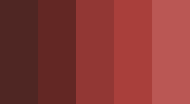
- Tone is made by adding gray to a pure color or original color.
- By adding grey, the color becomes softer than the original color.
- Tone can be lighter or darker depending on the traces of grey.
Intensity
- Intensity adds interest to the properties of color.
- Intensity refers to brightness or dullness of a color.
- Brightness is the degree to which a color appears to be radiating light.
- Adding white, black or grey will alter the intensity and value of it.
- Mixing the hue with complementary color changes the intensity.
- The highest intensity is the hue as it appears in the color wheel.
- You can make colors less intense (duller) by mixing them with grey.
- Creates an illusion of depth.
- Less intense colors-example-blue.
- More intense colors-example-yellow, red, orange.
Frequently Asked Questions
The three main properties of colour are hue, value, and saturation. Hue refers to the colour itself, value indicates its lightness or darkness, and saturation describes the intensity or purity of the colour.
Colour properties help designers create visual balance, contrast, emphasis, and harmony. Understanding how hue, value, and saturation interact allows architects and designers to influence mood, perception, and user experience within a space.
Colours can significantly influence how a space is perceived. Light colours often make rooms feel larger and more open, while darker colours can create a sense of intimacy, depth, and enclosure. Colour selection plays an important role in architectural and interior design.
Hue identifies the actual colour, such as red, blue, or yellow. Value measures how light or dark a colour appears, while saturation determines the colour’s intensity or vividness. Together, these properties define how colours are perceived and applied in design.
Architects and interior designers use colour properties to establish visual hierarchy, improve spatial perception, create focal points, and enhance the overall atmosphere of a space. Strategic colour selection can influence both aesthetics and functionality.
Master the Fundamentals of Colour in Design
Take your understanding of colour beyond theory. Learn how colour, value, intensity, and other essential design principles come together through practical architecture and design courses.




Leave a Reply